Working Space
Working (colour) Space General information
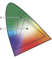
Cameras, scanners, monitors and printers display colours differently from each other. Or to put it another way, the same RGB numbers in a file will look different when displayed on different devices. Some devices may be incapable of representing the colours you want — typically, printers have smaller "colour gamuts" than screens. The Working (colour) Space is the range of colours that you instruct Photoshop to use by default when you’re working with images.
Why working (colour) space is so important
When we use Photoshop we need to choose a "working space". That is the colour space into which Photoshop will, by default, convert your images when you open them for editing. That working space information will be saved, and passed on to other devices using the file, to interpret its colours.
Not all colour spaces are created equal, and choosing between them needs some thought. On the one hand there's no point attempting to work with colours that your camera can't record, your monitor can't display, or your printers can't print. You might think therefore that your working (colour) space should be the “lowest common denominator", a gamut that includes only those colours that all your devices (and ours) can deal with. That may be why some labs suggest that you use sRGB as your working space, because it's "safe".
But using a too-restrictive colour space can degrade your images, so you can't take full advantage of your camera or printer's capabilities. In effect you're throwing away colours that could be in your images. But a too-wide gamut colour spaces can be problematic too, as you may be looking at colours on-screen that can't be printed.
So it's important to understand Working (colour) Space, and set up policies around it. If you don't, your colour management systems will fall apart, you'll have hassles when you're creating your image files and album layouts for printing, and your prints might not look the way you expect.

What we recommend
We recommend that you adopt Adobe RGB (1998) as your working (colour) space when printing with Queensberry. This is because of its bigger colour gamut and is the only option for Digital offset-printed orders. Adobe describes Adobe 1998 as “the largest recommended RGB working space and suited for print production with a broad range of colours”).
As an alternative, you could use sRGB for Silver Halide and inkjet printing. For a lot of labs that's the best option, but not for us. We have spent a significant amount of time and money (and frustration!) getting the best out of our printers and media. We recommend you use Adobe as your Working (colour) Space to take advantage of this.
However, we don't want to get too heavily involved in the
Reminder: Press printed album image files need to be Adobe 1998. This is important for third party design (PJ will automatically convert files to Adobe 1998). Read more on third-party design specifications here.


